
Project overview:
Webhint.io is an open-source project supported by Microsoft. It is a lint tool that helps users improve their website by checking accessibility, speed, security, and more. In this project, we worked on redesigning the online scanner.
My role:
I worked closely with the Microsoft development and design team on this project, conducting research, running usability tests, and proposing a new design to improve user experience.
The online scanner worked well for the most part, but there had been complaints about usability from the internal Microsoft development team, as well as from users.
After reviewing the research results with the Microsoft team, I updated the design to help enhance the user experience.
Stakeholder
Microsoft Engineering — The Microsoft Engineering team supports various projects, including the webhint.io initiative. The webhint team consists of a program manager, two engineers, and a designer. The team manages webhint.io end-to-end product development and look for external design and development help when additional resources are needed.

DISCOVERY
During the discovery phase, I conducted stakeholder interviews and usability testing of the online experience to identify areas to improve.
Stakeholder interviews
It’s essential to understand the product from the stakeholder’s perspective. In this case, the stakeholders were also the developers and designers who built the product. I first started by interviewing each team member individually to get a better understanding of the pros and cons of the tool.
Afterward, we had a meeting to review the internal report. Names were removed in the report to eliminate biases.
Usability testing
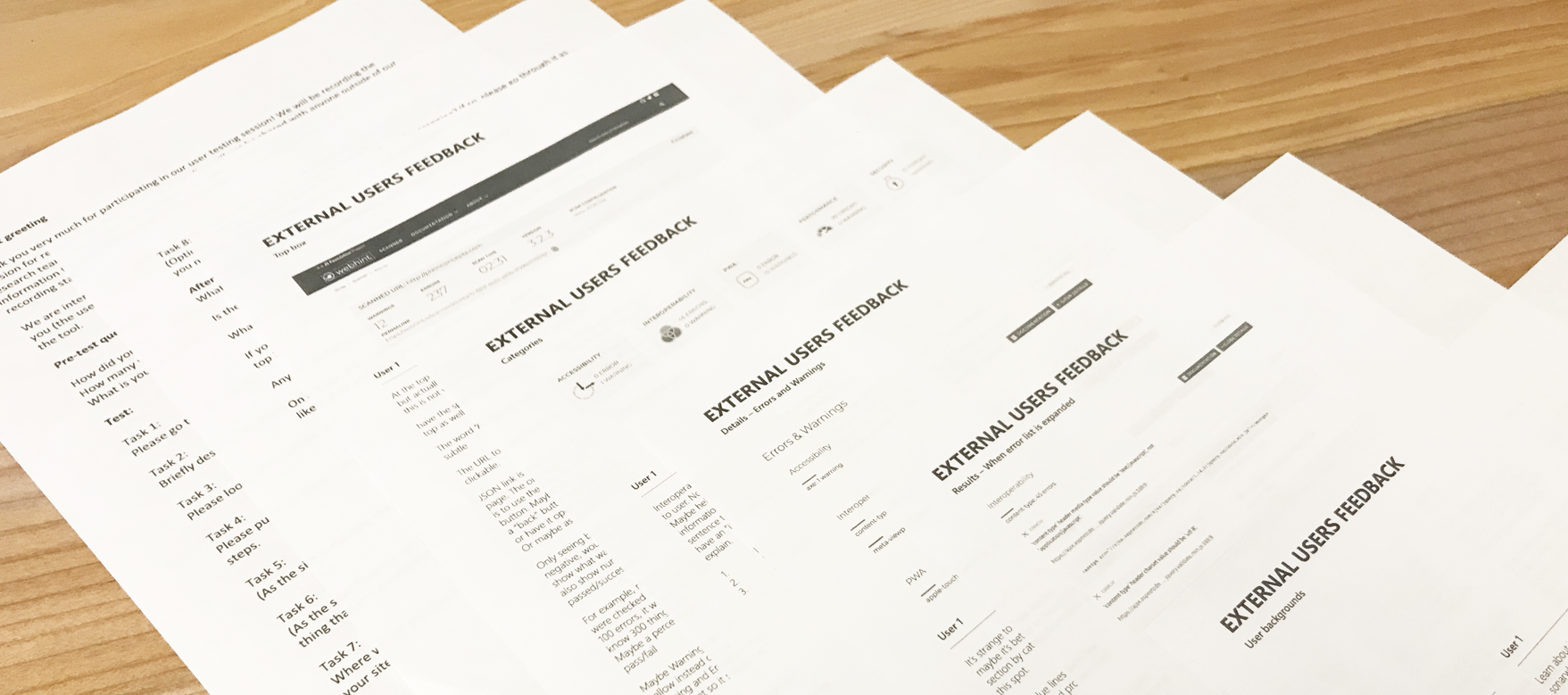
After hearing from the stakeholders, I conducted usability testing with four users to get a deeper understanding of any existing issues. The full report is not shared here for privacy issues.
DEFINE THE PROBLEM
Based on the research, we identified a few essential items to prioritize:
· Look for ways to manage additional categories so the tool could evolve
· Eliminate unnecessary elements
· Clarify and simplify the experience
PROTOTYPE
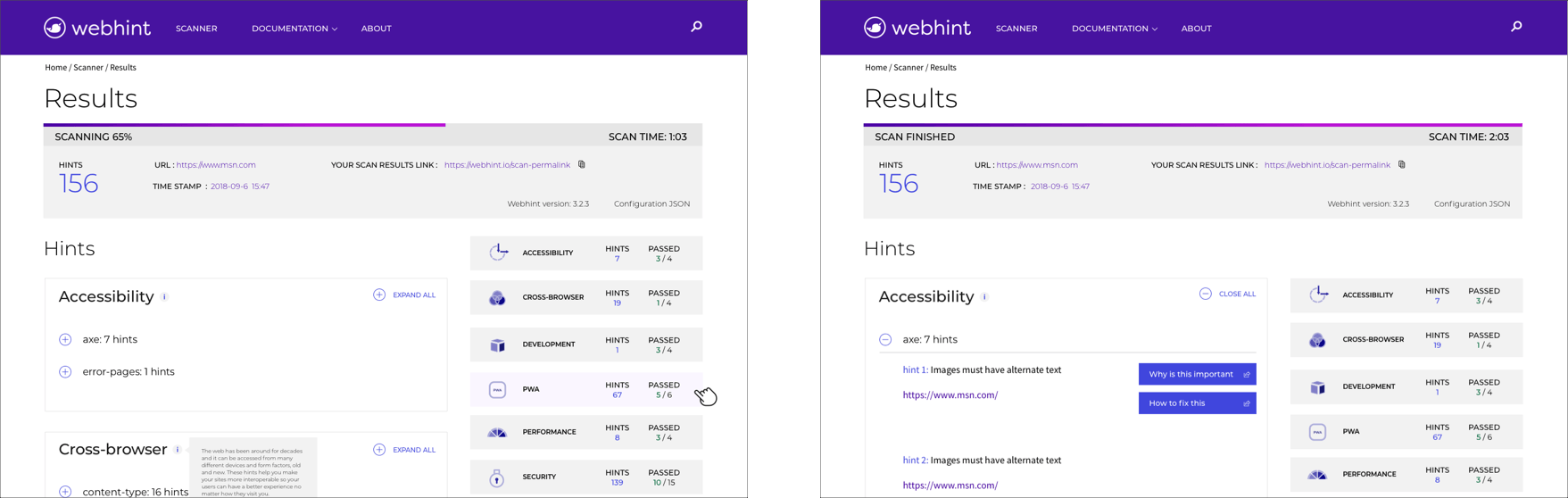
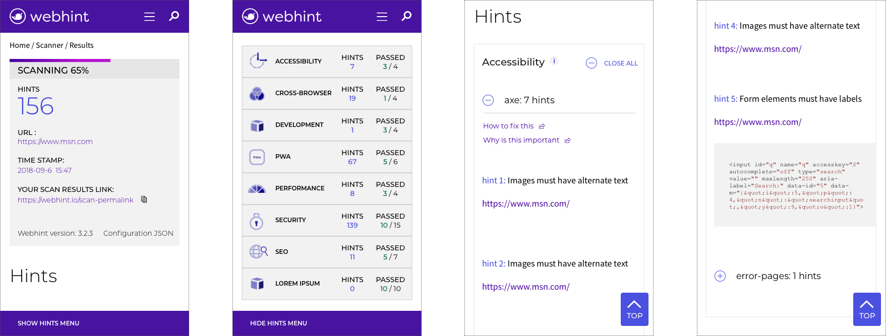
Taking a closer look
I presented the usability testing analysis to the team and worked closely with a Microsoft designer to come up with the final design solution.
Scan queue screen
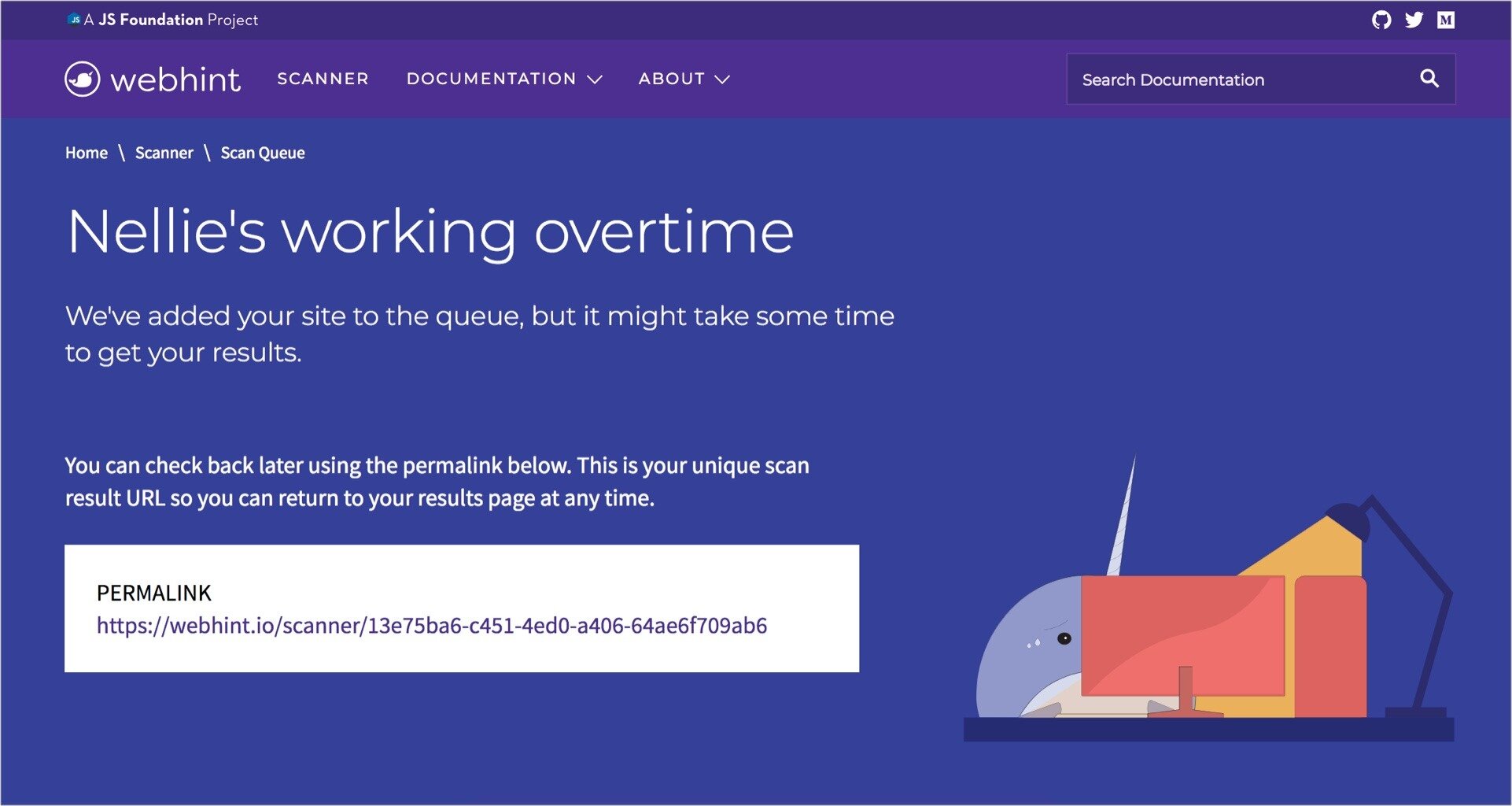
Users see this screen while the scanned page processes. Processing ranges from a few seconds to a couple of minutes.
Issues:
If the page only displays for a few seconds, there isn’t enough time to read the information. Some users thought it was an error page.
Solution:
The average time to read the content on the screen is about 20 seconds, so we decided to only display it if the wait time exceeds 30 seconds. For cases under 30 seconds, the user sees a results loading screen instead.
Results page top infobox
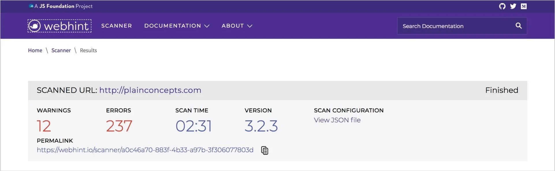
The infobox provides a few key information points regarding the scan results, including the number of errors, warning, and scan time.
Issues:
· It’s confusing to have both warnings and errors
· It’s not clear what the Permalink is for
· Some elements, like versions and scan configuration, were not important to the average user
· There’s no indication if the page is still loading
· It’s not clear whether this is these are the final results or if there are more
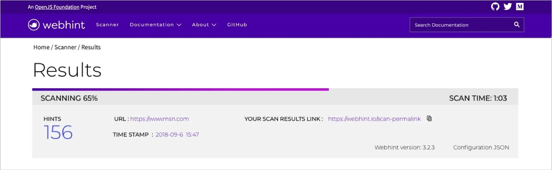
Solutions:
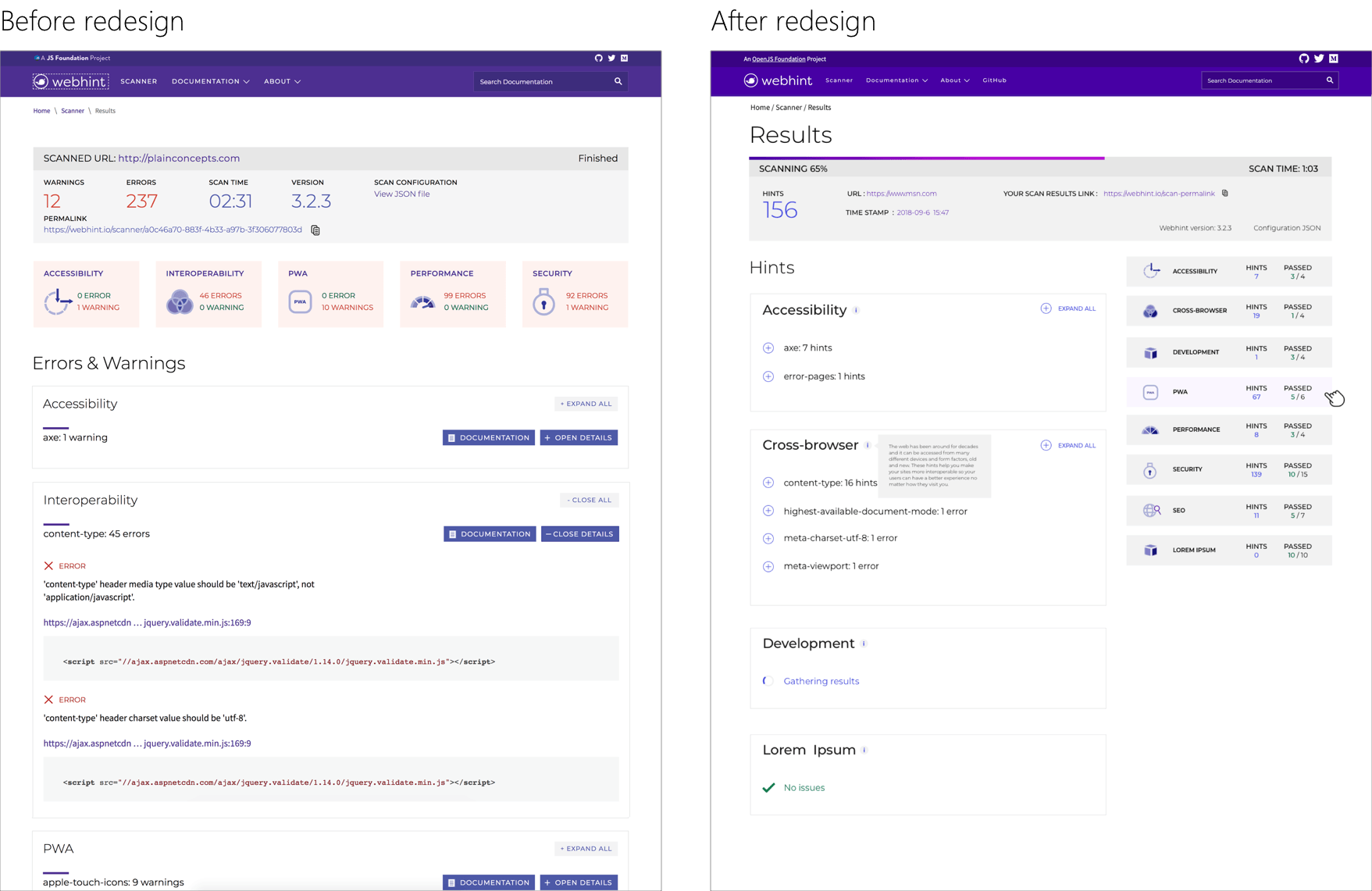
· We added an H1 title to clarify that this is the results page.
· A progress bar shows if the page still loading. We placed the Scanning/Finished label on the left, immediately below the bar to make it more visible.
· We combined warnings and errors and changed the label to “Hints” to help eliminate confusion and more accurately define the issue. If a page is working fine but can use some minor styling updates, "error" or "warning" is not appropriate.
· We added a timestamp to help users to track results scanned at different times.
· We changed the Permalink label to “Your scan results link” to clarify its purpose.
· Because version and configuration type are information for the dev team and troubleshooting, we reduced their prominence.
Categories

The scan results are displayed by category for better organization.
Issues:
· Some categories are not clear
· A few test participants just skip down to the results
· It's not clear why some errors and warnings are shown in red, while others are shown in green
· Only the title of the categories is clickable, and it's not clear to users that they can go to the specific category
· The tool counts the individual number of instances, resulting in an overwhelmingly high number of errors
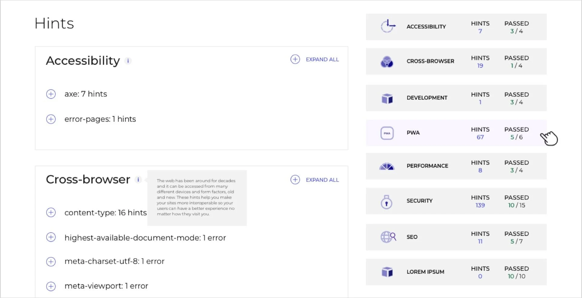
Solutions:
· We moved the categories to the right to allow the tool to expand over time.
· The entire category box is clickable, and a hover color helps users understand the box area is clickable.
· The categories are persistent on the right as users scroll. They can click on categories or scroll to different areas as they wish.?
· We added a "Passed" feature to give the user a fuller picture. It shows how many rules passed and the total number of rules.
Errors & warnings
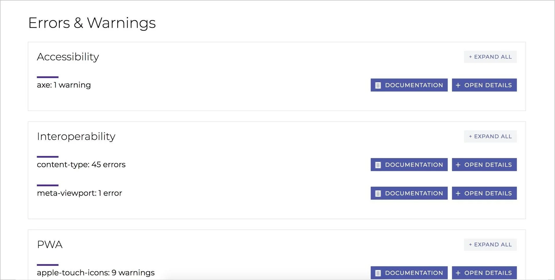
This section shows the different errors caught by the online scanner.
Issues:
· The purpose of the documentation and open details is not clear with the location of the buttons
· The title on the left is not clickable
· The bar design on the left looks like a progress bar on first glance
· When test participants click on “documentation,” it is difficult to return to the test results
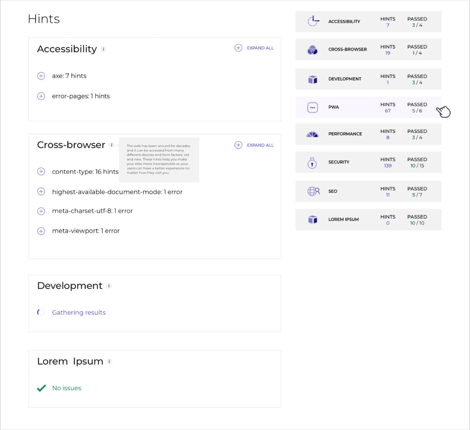
Solutions:
· We replaced the “open details” button with a universal “+” icon to let the user know they can expand the section
· We moved the position of the “+” icon to the left of the title
· We moved the “documentation” button to the next level to avoid taking users off the results page too soon
· We added an “i” icon to provide category summaries to reduce ambiguity
· We removed the bar design element
· We implemented a loading gif icon to show if a section is still scanning
· We added a checkmark design to display when there is no hint in an area
Expanded view
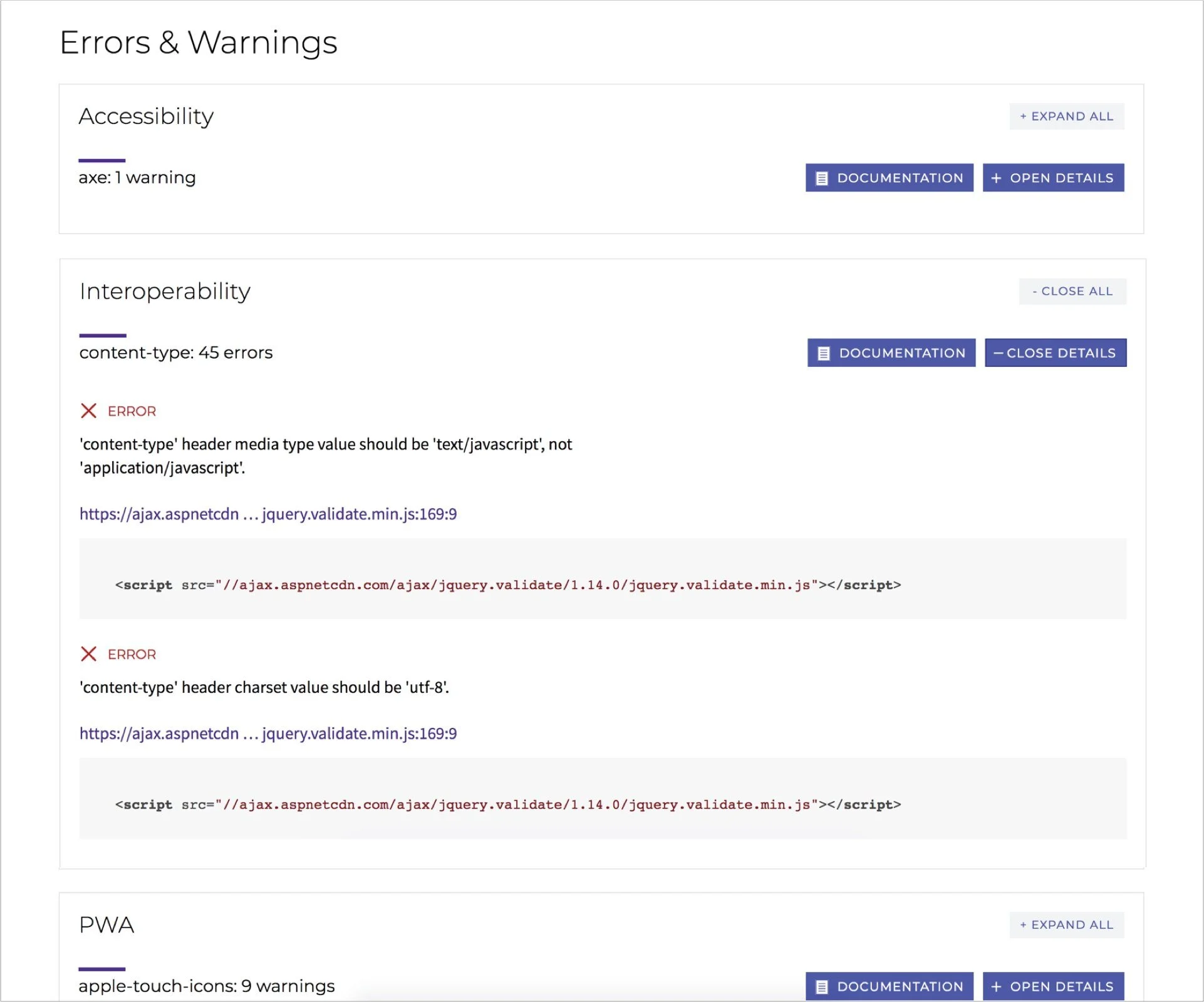
Issues:
· It’s difficult to tell if a URL is associated with the error above or below
· It’s not clear what documentation is for
· The URL is truncated for no apparent reason
· It is confusing to see two close buttons on the right
· The page is long and it’s challenging to keep track of all the errors
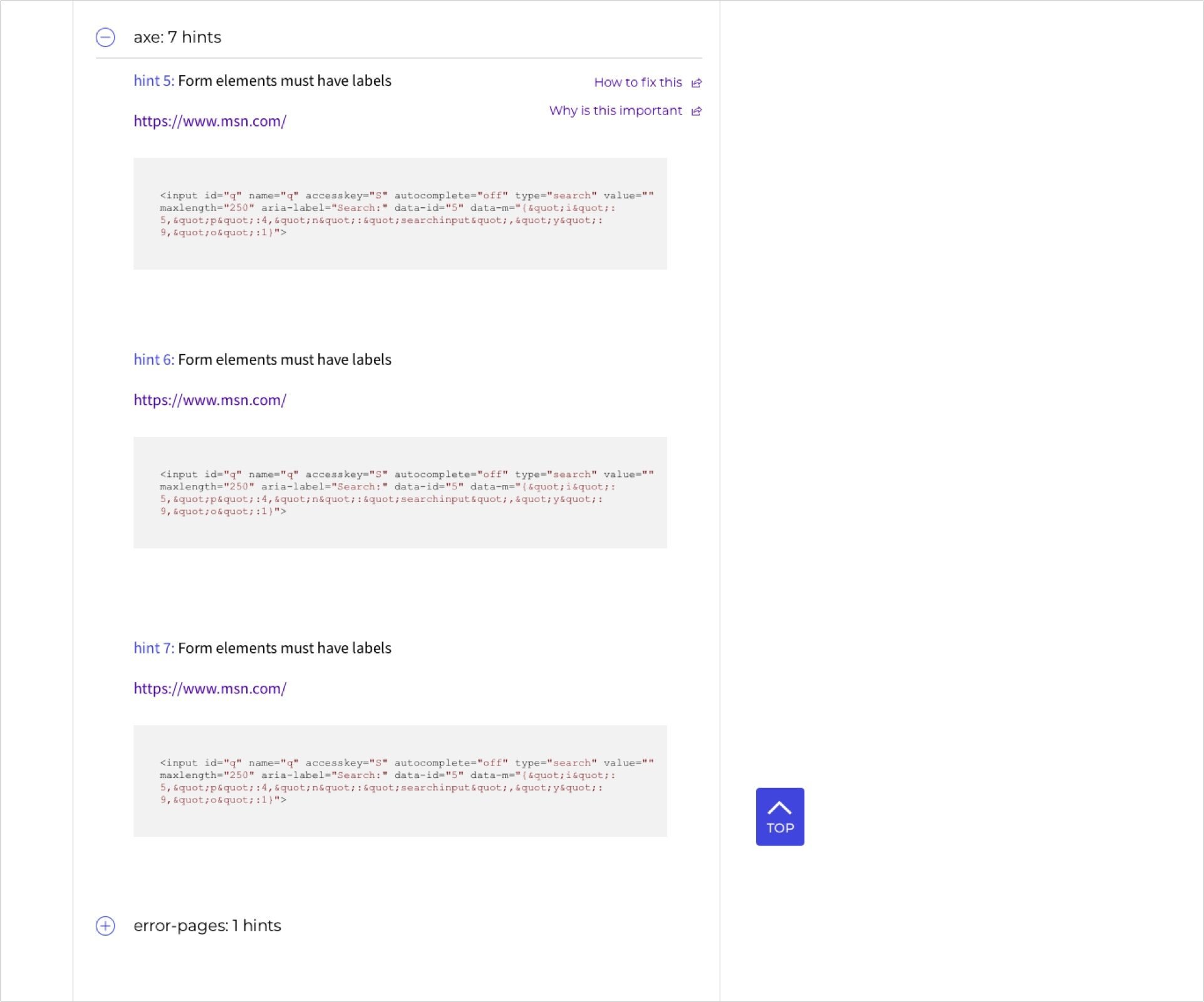
Solution
· We numbered the hints to help users differentiate between them
· We added spacing to separate the different hints
· We changed "Documentation" to a more explicit “How to fix this”
· We added a “Why is this important” button to provide insights on specific issues
· We added a “Back to Top” for easier page navigation
RESULTS
Everything went pretty smoothly for most of this project, and we were able to complete the UX and redesign part within four weeks. The overall sentiment of the redesign was positive. However, we were not able to get actual data to confirm redesign effectiveness for Microsoft security reasons.
Challenges we worked through:
· Limited budget
· Conflicting feedback from stakeholders
· Time constraints
· Not having access to the analytics